Archives

OUGD401: Love & Hate

Love


(Click to Enlarge) The above image is a fantastic piece of Graphic Design. The use of colour, limiting it to blues and greys for a simplistic design, a well thought out selection of fonts. I also think the vector banners add a nice quality to the image.


This is an alternative post to the 5th element. The use of warm colours, with the contrasting black and the striking white works extremely well in this image, the warm colours blending together with the harsh white being very in your face.


Hate


The above image is from "crap is good", which is a new style, which as you can see if pretty crap, the simple font, centre aligned looks okay, however the random architecture-style images thrown around the pages makes the entire book cover look poor. Crap is good? Crap is crap.


The above is another piece of Graphic Design i hate from crap is good. It's poorly designed, it looks cluttered  using lots of unnecessary hyphenations. The variation of fonts also throws me off, I do not like it.

OUGD403: Echolocation Research

For the newspaper article, I'm doing additional research on Echolocation. Whales are fairly renown for using echolocation, dubbed as whale songs. These are not usually detected by human ears, but Noc, the Beluga Whale, speaks several octaves lower than most other whales, detectable by human ears.


"Echolocation, also called biosonar, is the biological sonar used by several kinds of animals. Echolocating animals emit calls out to the environment and listen to the echoes of those calls that return from various objects near them. They use these echoes to locate and identify the objects. Echolocation is used for navigation and for foraging (or hunting) in various environments. Some blind humans have learned to find their way using clicks produced by a device or the mouth"


"Beluga whales have been called "canaries of the sea", and anecdotes of their capacity for mimicry have been reported in the past.[2] For example, the first two scientists to study the calls of wild Belugas wrote that "occasionally the calls would suggest a crowd of children shouting in the distance", and keepers at the Vancouver Aquarium said that a 15-year-old Beluga named "Lagosi" was able to speak his own name.[4] However, NOC's human-like calls were the first of their kind to be recorded.[5]
NOC's vocalizations were recorded and studied by a team of biologists from the National Marine Mammal Foundation (NMMF) led by Sam Ridgway. In 1984, Ridgway and others at the NMMF began to hear peculiar sounds coming from the whale and dolphin enclosure. They were reminiscent of two people talking in the distance, the words just beyond the limit of comprehension.[3] Later, a diver working in the enclosure came to the surface after he heard someone cry "out, out, out!"[1] After he asked his colleagues "Who told me to get out?", they realized it had been NOC.[5] They immediately began to record the sounds and reward him for the behavior, teaching him to make them on command. Eventually, they installed a pressure sensor in his nasal cavity to better understand the mechanism by which the sounds were produced.[5]
According to Ridgway, "They were definitely unlike usual sounds for a [beluga], and similar to human voices in rhythm and acoustic spectrum."[1] Unlike humans who use their larynx to produce sounds, whales use their nasal tract. Data gathered from the pressure sensors indicated that NOC was using his nasal tract as well, although he altered his normal vocal mechanics.[3] In particular, he over-inflated his vestibular sac, which is normally used to prevent water from entering the lungs.[5]
NOC's vocalizations were described during a conference in 1985, and in a 2012 paper by Ridgway et al. which appeared in Current Biology" 


OUGD401: Lecture Notes


OUGD403: Newspaper Article

For this assignment, we were asked to find a newspaper from Tuesday the 23rd of October 2012, and select an article to visually explore. The newspapers I've picked up were The Daily Mail, The Independent and The Guardian. 

The Article I've chosen

The Daily Mail Copy


The Independent Copy


I've decided to explore this article as I feel it has great potential for some really creative things. I could explore the biology-side of the story and do a deep analysis of the speech, cross sections and maps of the bodily systems which would be involved to aid in the whales speech. For example, something like the below:


"The whale’s sounds were produced in a way different from normal whale sounds.
Unlike echolocation clicks, ordinary pulse bursts, and whistle-like sounds, the production of speech-like sounds involved marked inflation of first one and then the other vestibular sac. This was readily observed on the surface of the whale’s head and may have been necessary to emphasize lower frequencies of the speech-like sounds. In usual white whale sounds, such extreme inflation of these sacs is not evident.
Sadly, the speech-like sounds disappeared after four years when the beluga had matured."


"The amplitude and rhythm of the whale’s sounds were very smilar to that of human speech; here’s a sonogram from the paper showing the resemblance."
Ridgway, S., D. Carder, M. Jeffries, and M. Todd. 2012. Spontaneous speech mimicry of human sounds. Current Biology. Current Biology Vol 22 No 20,  DOI: 10.1016/j.cub.2012.08.044


OUGD403: Name Tag Research

Sadly, my search of name-tags as come up rather sparse, despite the odd "Hello My Name Is" badge as we see most of the time. There was nothing which was cutting edge, new and innovative which I could use for inspiration in my designs. 


An example of a boring over-used name tag design.

Thankfully, I don't need to leave a gap for the recipient to write their name, I have to use my font and insert her name into the design. So, I've decided to look as some clean use business card styles for some inpspiration.


http://www.flickr.com/photos/callumchapman/

Above we can see a nice use of colour, I really like the brown colours used in these designs, I think it adds a nice contemporary quality to the designs, which I've love to include in my own designs. I also really like the simplicity in these designs, the use of shapes and a small amount of text gives the clean quality to the card, which I'd also like to use in my own designs.


http://www.123rf.com/profile_pall

I don't particularly like the design of the front of the card, however, I like how the designer has used lines on the back to separate the image up, I'd hope to implement, only this, into my designs.


OUGD401: Lecture Notes


OUGD403 Research: Time-Travel

As part of the brief, I've decided to use an additional element to the designs, as advised in the group crits. So I've using Lizzy's desired super-power, Time travel. However, I don't want to use the shape of a time machine in the images, as they're extremely complex. So i've decided to use shapes which correlate and represent time travel. 

Being a former film student, I thought I would turn towards the genius Alfred Hitchcock for some inspiration in my design. In his 1958, masterpiece, Vertigo, he uses a recurring motif, the spiral, as a means of communicating James Stewart's character's struggle to to escape the past.


As you can see, a spiral, which shows an illustration of James Stewart's character falling into the past, being trapped there, metaphorically. This is Hitchcock's way of representing time, almost traveling from the present to the past. Hitchock also uses the motif in very subtle ways, such as in a hair style, a stair-case and through the rings in a tree, amongst others.

OUGD403 Design Skills: Alphabet Soup (Task 2)

Noma Bar

For this part of the task, we were asked to questionnaire our "subject", Lizzie. From this questionnaire I've learnt her favourite designer is Noma Bar. So I've conducted research into this designer.


Bar uses alot of simple shapes, minimalistic style to create a simple yet effective image. He often seems to use few colours in his work to achieve the simple minimalistic look, for example, in the image below, it depicts a dog, the largest white shape, and a cat, the smaller black cut out, from the white image, creating the dog's mouth.


I really think I can implement this style into the "Lizzie-font", perhaps, the negative space in the images, such as in a "G", could be shapes of things she enjoys, or even her favourite things. I think I could also replicate the bold, blocky forms from his images in the styles of the letters. 

I think the font Bubbleboddy would be good starting point to base the font from, the then adjust the styles and forms of the letters to my liking.


OUGD401: Lecture Notes


OUGD401: Prospectus Analysis


The above is the new college Prospectus, in this short analysis I'm going to run through the good and bad points of this monstrosity, handbook. To start with, we have the front cover, printed in glossy red type a matte blue card with "Leeds College of Art" in times on the rear. The first problem we see here is the poor attention to detail. The front page would be centre aligned, but it isn't, due to the binder being placed to the left of the page, in the same colour, throwing the entire cover slightly to the right, the rear side suffers from this aslo.

Following this, we have the type itself, the simplistic looking font works fairly well, until you see the "W', which looks awful, and throws the whole page off. I would have used a clean simple font, such as Helvetica, with a normal W. Not so state of the art.


What on earth does this picture have to do with anything? Sadly, here, the introduction to the college of art is an image of the ceiling, not exactly sure what the designer was thinking here when he designed this page, and chose the image. I would've gone for something more traditional, such as an image of the front of the college from the outside, or the mosaic. Something which is moderately relatable, if that's not too much to ask.

The rest of the prospectus continues in a similar fashion, the images aren't the most relatable, or flattering, some of the images are literally thrown on the page in a obtuse order, which is really a shame, so much more could've been done to this, in my opinion. This is leaning more towards a deterrent than a persuasion.


OUGD401: Context Of Practice Task 2: Image Analysis Exercise


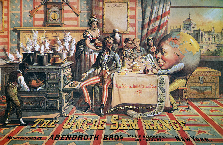
The first image we see is The Uncle Sam Range (1876) Which is an advertising image, by Schumacher and Ettlinger, it was from New York. The objective of this image is to advertise, using America as a selling point, this is because: The image itself contains some iconography of America, the first of which would be the decoration around the room, which is very impactful, bright recognizable colours, the red, the white and the blue, these being the colours of the American flag. An addition to this, we see the bald eagle, which is another symbol of America.
            Secondly, in the upper left of the image, we see a clock, with the hands pointing at twelve and six, however, the clock does not read twelve and six, the clocks read 1876 and 1776, 1776 being the year which the declaration of independence was signed, 1876, the year this image was created, and the year on the twelve position on the clock is 100 years after the previous event, a celebration, which is the selling point.
            The image also shows us a personification of the world, using a globe with arm legs and a face, over Africa, holding a list, listing countries of the world, and they stereotypical eating habits. Who is sat at a table, with Uncle Sam, the personification of America, on the right of the table. The tablecloth has “Uncle Sam’s Little Dinner Party” written on the side. So, from this you could argue that the image is about inviting the world to dinner, showing their greatness, in the form of the ovens, with 100 years of independence.
            The second image, a poster by Savile Lumley, 1915, is a mid-world war one propaganda-style recruitment poster. The image itself, is set post-war, as we can see the man in the arm chair, hand on chin, almost recounting memories of the war in his head, however, his eyes are looking out at you, not only to grab your attention, but to relate the image to you. The text at the bottom of the page exclaims the following; “Daddy, what did you do in the Great War?” The first link I can make with this picture and the previous image would be the post-war almost reflective-celebration, we have. The nationalism “inviting the world to dinner” and in this one, the happy family scene, reflecting on the war. However, the obvious difference is the previous image was to advertise a product, using nationalist as a promotional tactic, whereas the second image is recruitment advertisement. 
            A second link that can be made between this image and the previous would be that the images are both quite nationalistic, the first image is very bold and in-your –face, however the second image is quite subtle, for example, we see the royal lily pattern on the curtains and on the chair, we also see that the son, in the bottom right, is playing with soldiers, not normal soldiers, but that which you would see at the palace, who guard the royal family, and patrol the grounds.
            The target audiences for both pictures would also be men, as the central characters of both the images are men, Uncle Sam and the assumed War Veteran. In the first image, we also see a woman serving him, with a black boy cooking, which was considered a status symbol, the second image depicts the family life, which at the time you’d assume was an ideal.


The Uncle Sam Range (1876) Advertising Image by Schumacher and Ettlinger 


Poster by Savile Lumley (1915)


OUGD401 Context of Practice: Love & Hate

Task: 
To identify two examples of Graphic Design, one of which you love, and the other which you hate - justify your reasons for doing so.


I love this alternate Iron Man Poster. The bold red and yellow colour scheme represents the Iron Man suit, it works extremely well. I also think the centre aligned-simplistic, minimalistic layout works - it communicates exactly what it needs to communicate instantly. I think this is fantastic!


I hate this logo. As far as the alignment and justification goes, it's fine, however, It's an extremely poor choice of a typeface, it doesn't fit the seriousness of the profession at all, and looks very childish, not for their presumed target market, being grieving families.


STUDIO BRIEF 1 - VISUAL THINKING - ALPHABET SOUP

Using your newfound appreciation of the anatomy of typographic forms and the wealth of research that you have already gathered, focus on the manipulation of existing letterforms in order to solve this problem. 

My word was Layer.


The image above, the part in blue, shows layers of blue tiles, scattered around, but clustered together to almost make a shape. I think this will be useful for my design work, as I could incorporate this technique in my design work. 


The image above, layers of photographs, stacked on-top of each other, in a perspective-like effect, I hope to implement this into one of my designs.


A lizard, shedding layers of his skin. I thought it may be interesting to include this sort of idea in my work, perhaps creating a letter, shedding a layer of skin, to find a clean layer underneath.


This G is using overlaps, black and white, I've used this style before in previous projects from College and you can create some really complex and interesting. Adding several letters, to the image, to create more shapes and more variations. Creating an almost pattern like effect. I hope to implement this into my design. 


Copyright 2010. All rights reserved.

RSS Feed. This blog is proudly powered by Blogger and uses Modern Clix, a theme by Rodrigo Galindez. Modern Clix blogger template by Introblogger.